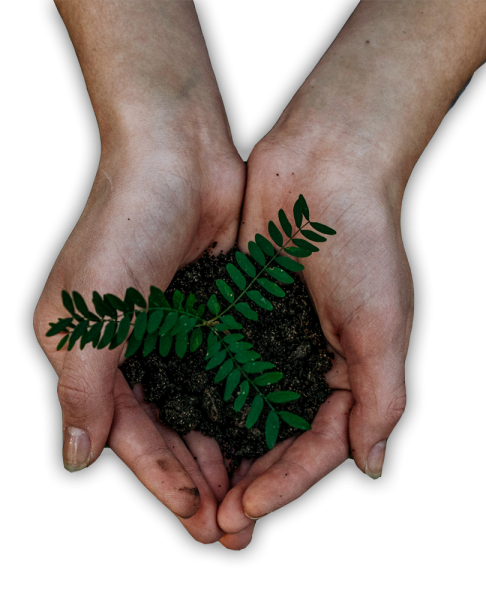
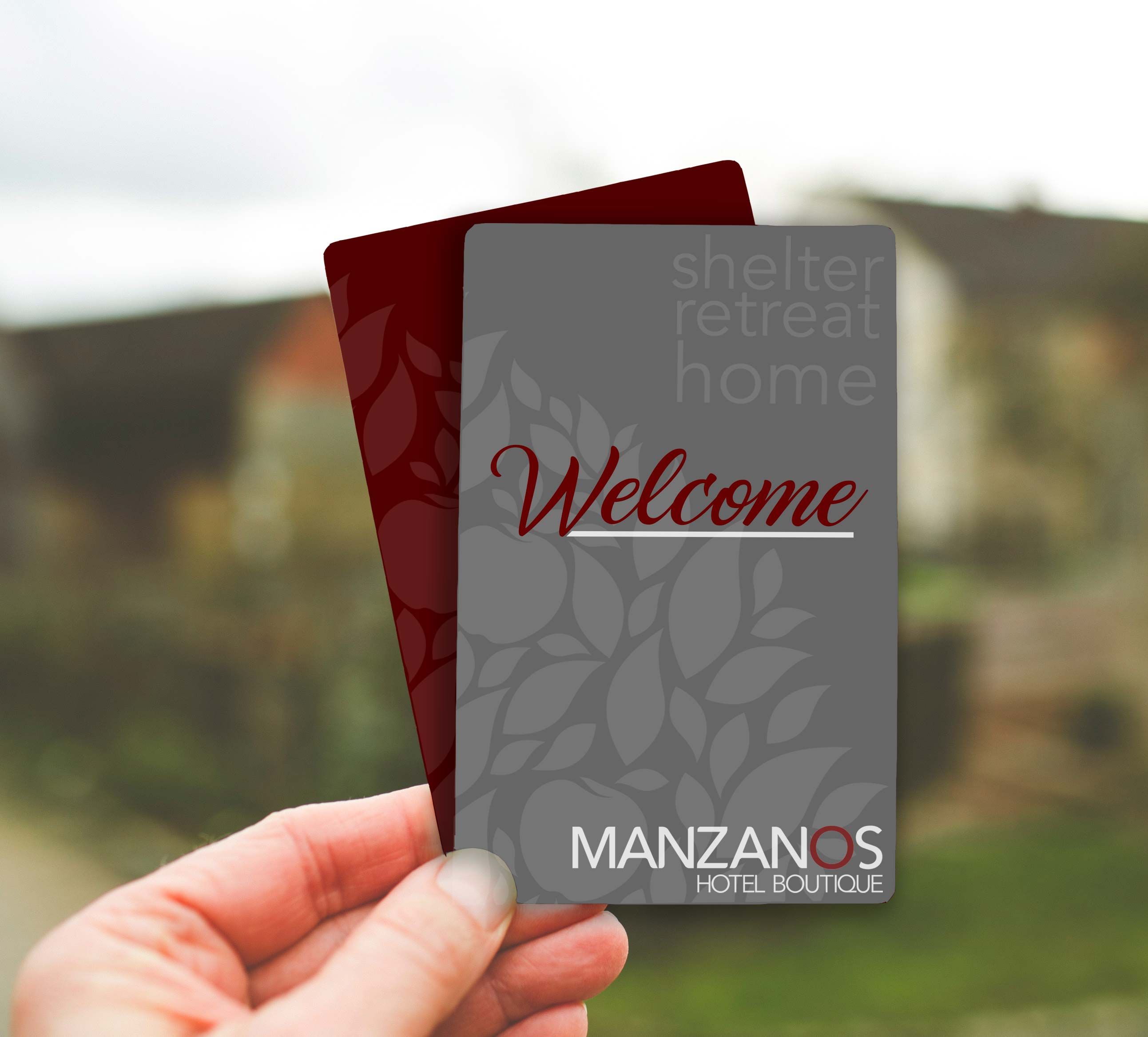
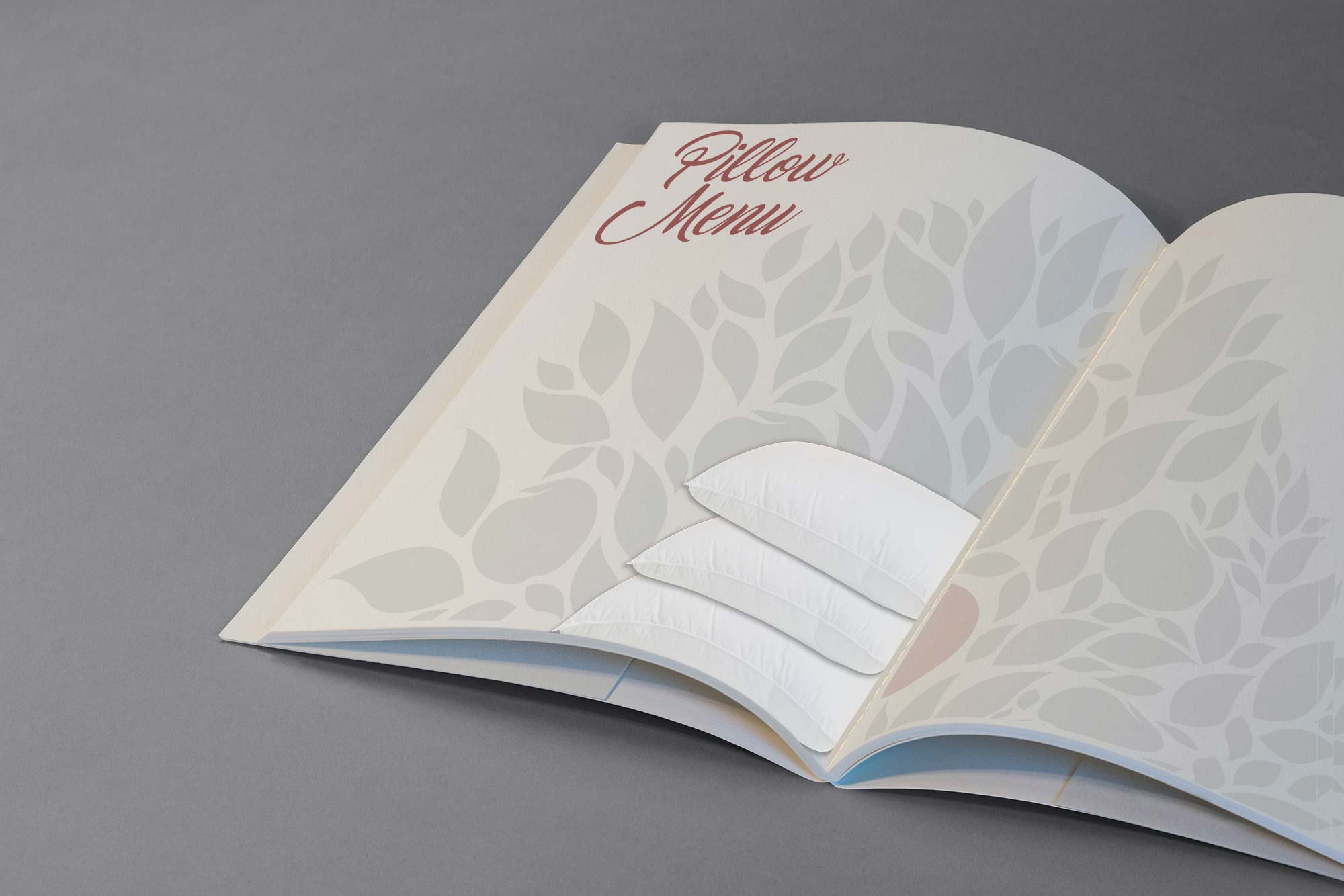
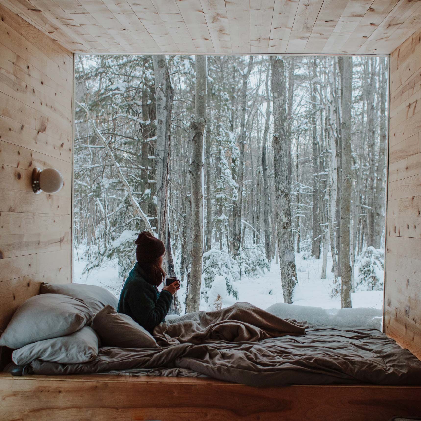
Manzanos have inspired me to create an accommodation concept that gives back more than what it takes. In a world where daily life drifts the focus away from our well-being, I wanted to encourage guests to connect with their roots, to disconnect from the routine, and to create beauty and abundance in a shelter that makes them feel just like home.
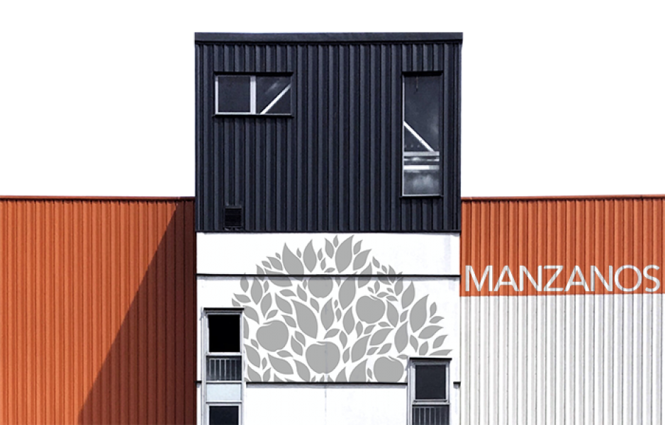
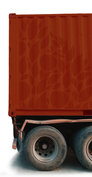
Manzanos takes second-hand shipping containers and redesigns them to create beautiful hotel rooms. The main four characteristics of the project are relocatable, well-rounded & friendly with both the natural and social environment.
Full Conceptualization
All details of the business model are outlined, including the pillars that will provide added value and will guide the direction of the business going forward.
Financial and legal viability is evaluated as part of the conceptualization.
Once the project is considered viable, the graphic image and Standard Operating Procedures are developed.
Relocatable
Well-Rounded
Friendly with the Natural Environment
Friendly with the Social Environment
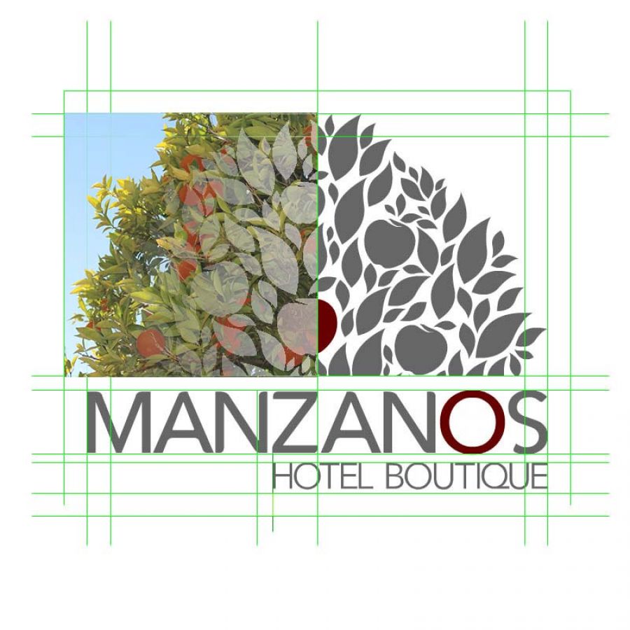
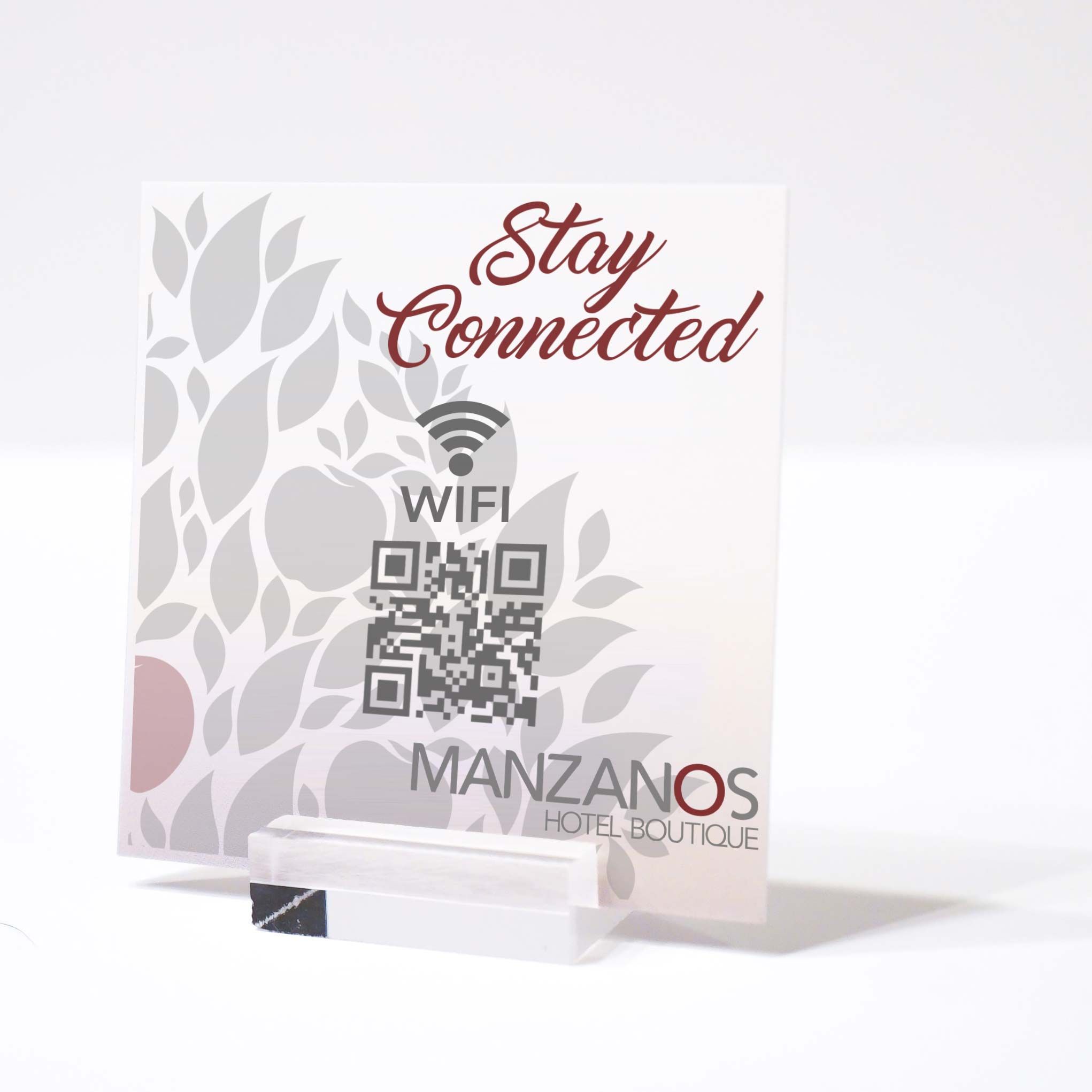
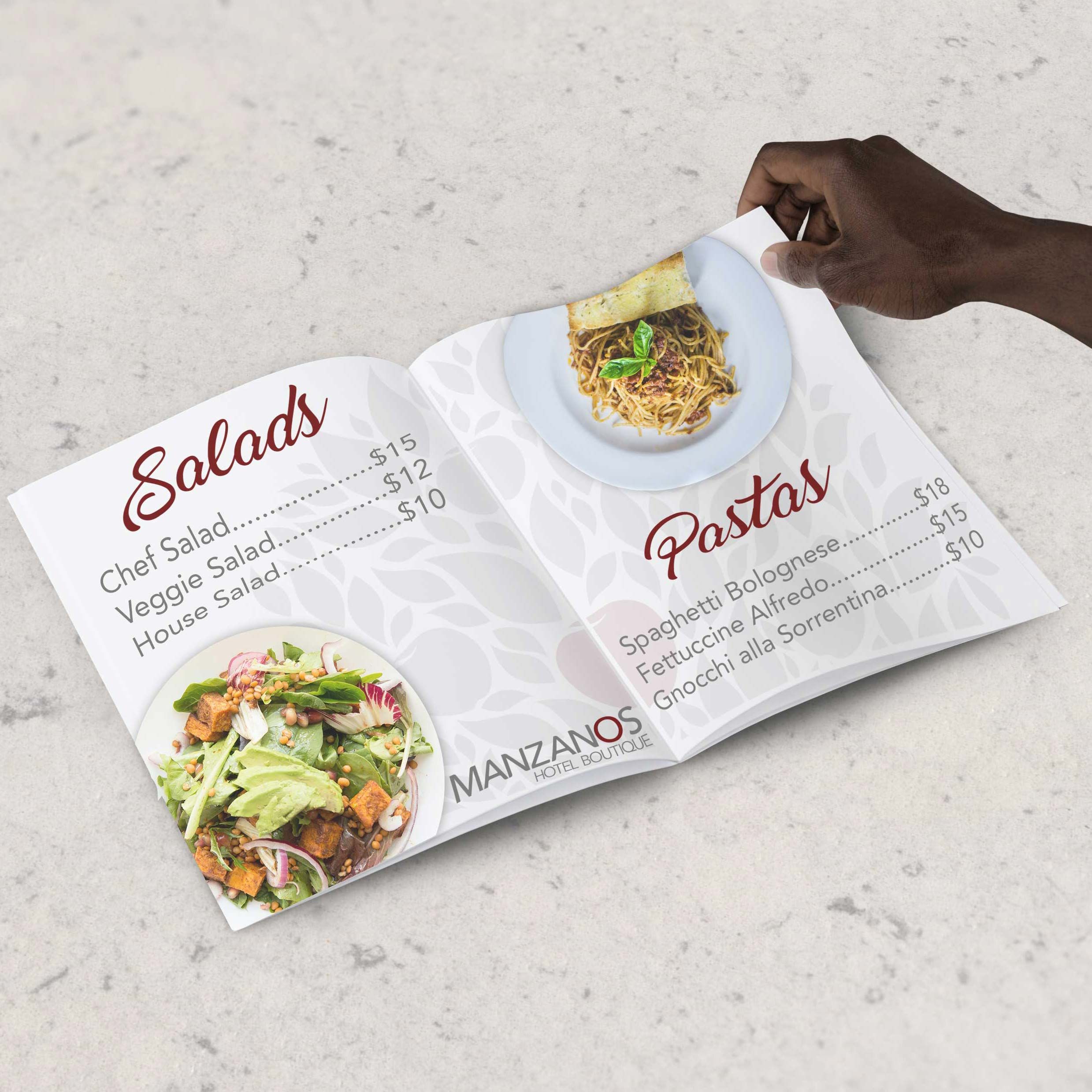
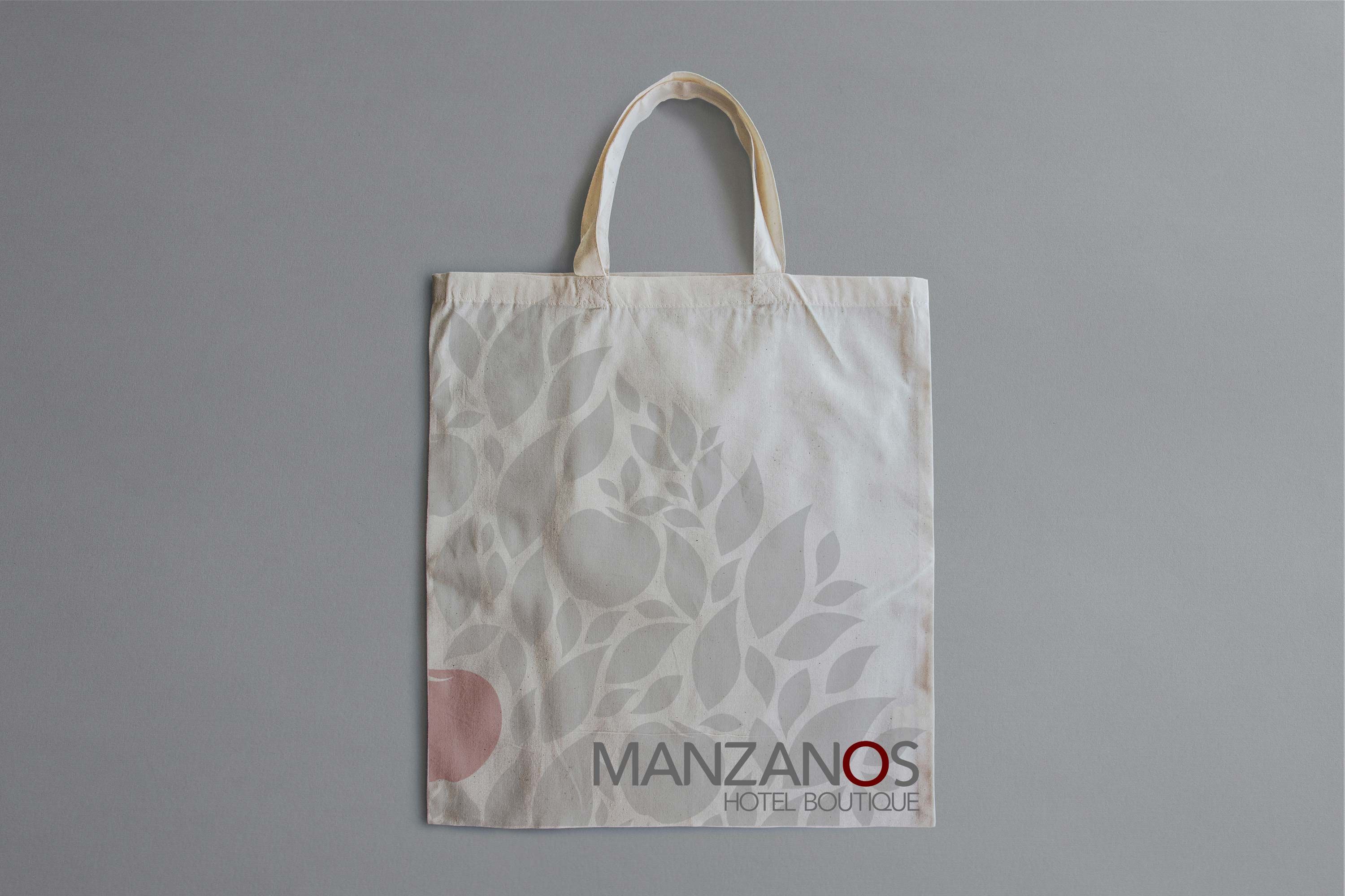
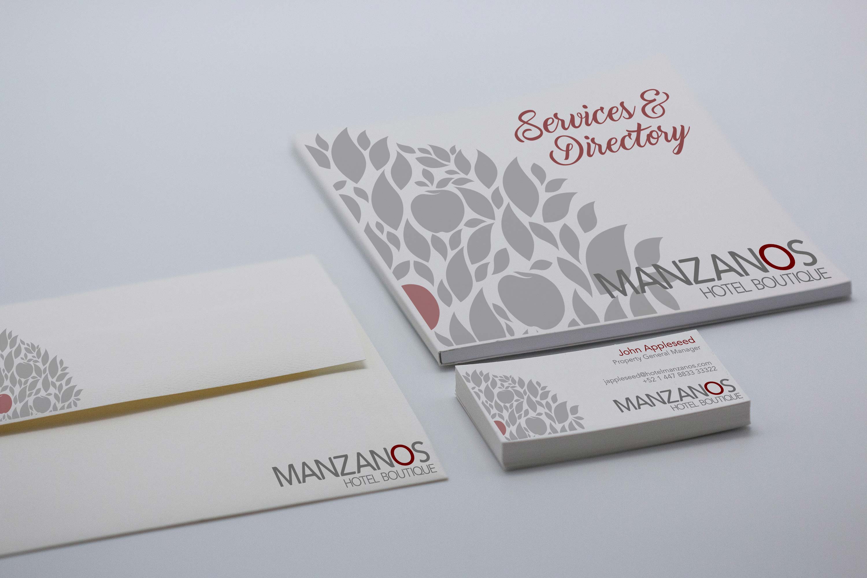
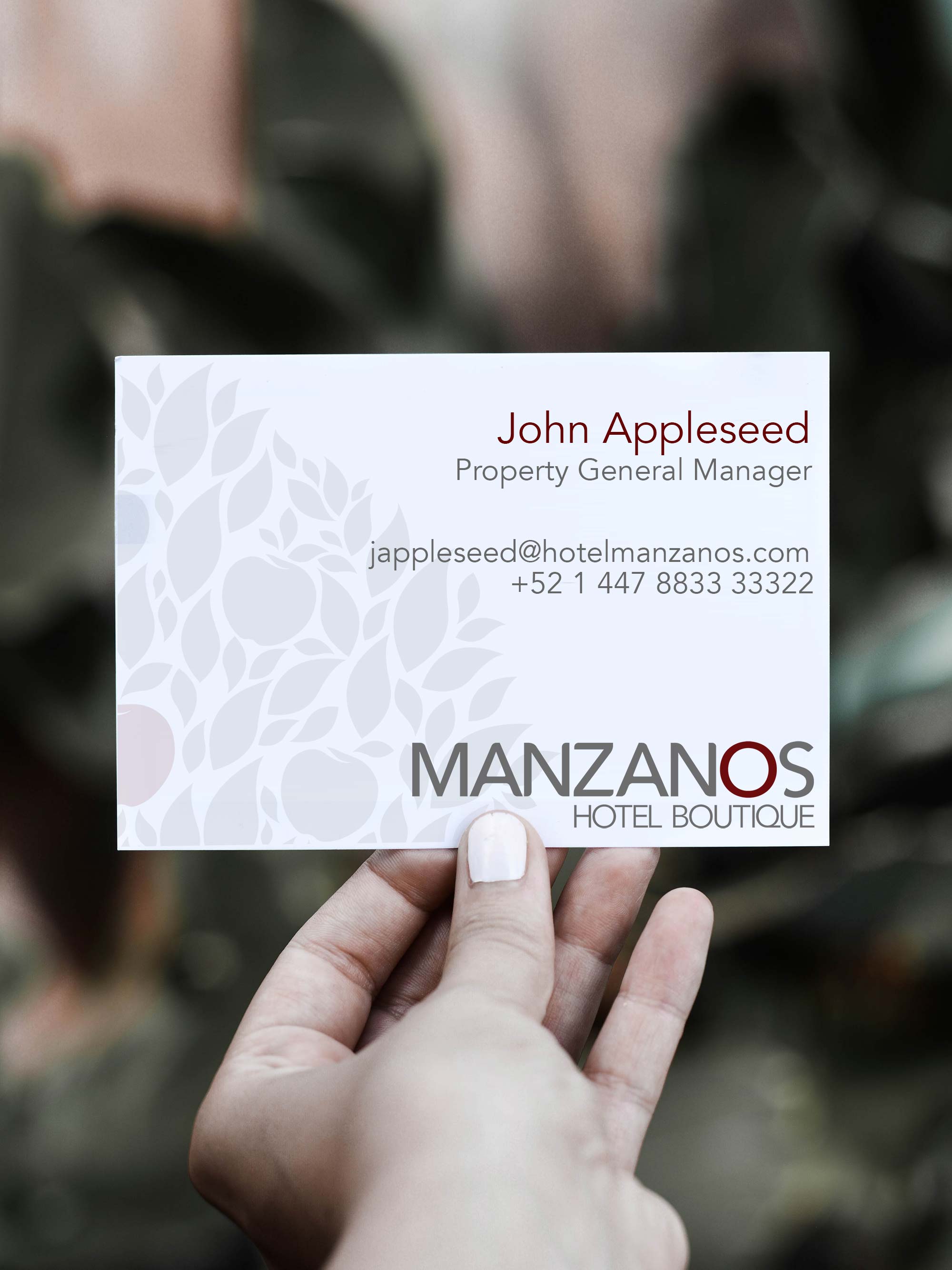
The logo
The logo was designed flowing from bottom to top, with a red apple in the middle. The red apple represents the guest as a reminder that they are the top priority of the concept. In contrast, the surrounding leaves represent opportunities to connect with their surroundings and revert to their roots.
Overall, the logo represents an apple tree, “Manzanos,” in Spanish. The name of the establishment is the trunk that feeds the leaves and fruits on top of it. These trees connect with essential elements earth has – such as water, minerals, and sunlight – through their roots and leaves. They adapt to their environment giving back much more than what they take.
Their trunk and shape represent strength throughout their long lives, providing shade, shelter, beauty, and delicious, abundant crops that have multiple uses and benefits.
The evolution of the Logo
|
|
The first prototype was focused on the elements of the project. The apple was a fusion of the shape of a container and the gray box with the name of the brand was a container itself. The green leaves represented nature. Although it was a good start, the proposal was too industrial. It was not aligned with the overall concept of wellbeing and connecting with yourself. |

|
|
The second prototype became monochromatic, more stylized typography for the text that gave a sense of consistency from beginning to end. The idea of sharp edges and squares was kept as a symbolism of the shipping containers. Although the proposal was adequate, it still didn't provide that welcoming feeling that a guest would look for in a hotel.
|

|
|
The third prototype was a fusion of the first and the second, reverting to the idea of having some colors while maintaining the new, stylized typography. The edges of the apple became more rounded, which began losing the original idea of having an apple-shaped shipping container and creating a contrast between the rounded corners of the apple and the sharp edges of the gray box containing the name of the brand. |

|
|
The idea of the rounded corners for the shape of an apple made me revaluate the essence of the project itself and the reasoning behind it. Connecting with yourself needs to feel natural, needs to flow, and align with the concept of nature. In this prototype, I introduced a more real-life shaped leaf for the apple, which later became one of the main elements of the final logo. |

|
|
The idea of the leaf became now one of the most critical elements of the development. I designed a new stylized apple that would flow with the design of the leaf. The typography was changed; however, it felt more like an old-style brand for a marmalade.
|

|
|
This version became a fusion of the typography of the second version plus the design of the apple from the fifth version. However, the leaf was too big, and I was afraid that the logo would resemble too many other brands in the market. There was also too much white, unused space in the upper right and left side. |

|
|
In this version, I wanted to outline the details of the apple, making the name of the brand look as if it was part of the fruit. The result was good, but the word Manzanos is the plural of apple trees, and the logo was flowing too much towards one piece of the fruit instead of the trees themselves. |

|
|
The combination of all the elements in the previous versions came down to the final version of the logo. The name as a block is the container, which represents the trunk of the tree. The leaves and apples increased as a sign of abundance and harmony amongst them, and the central apple, as well as the letter "o" of Manzanos, were highlighted in red, which is a characteristic color of apples. This was just the beginning of the rest of the development of the concept. |
| Primary color: |
#C4C3C3
#C4C3C3
|
#949494
#949494
|
#666666
#666666
|
#2D2D2D
#2D2D2D
|
#040303
#040303
|
|---|
| Primary color: |
|---|
| Secondary Color: |
#C4C3C3
#C4C3C3
|
#949494
#949494
|
#666666
#666666
|
#2D2D2D
#2D2D2D
|
#040303
#040303
|
|---|
| Secondary Color: |
|---|
Typography
Printed

Main Font

Secondary Font
Web

Main Font

Secondary Font
Logo

Full Logo

Full Logo

Wordmark

Wordmark


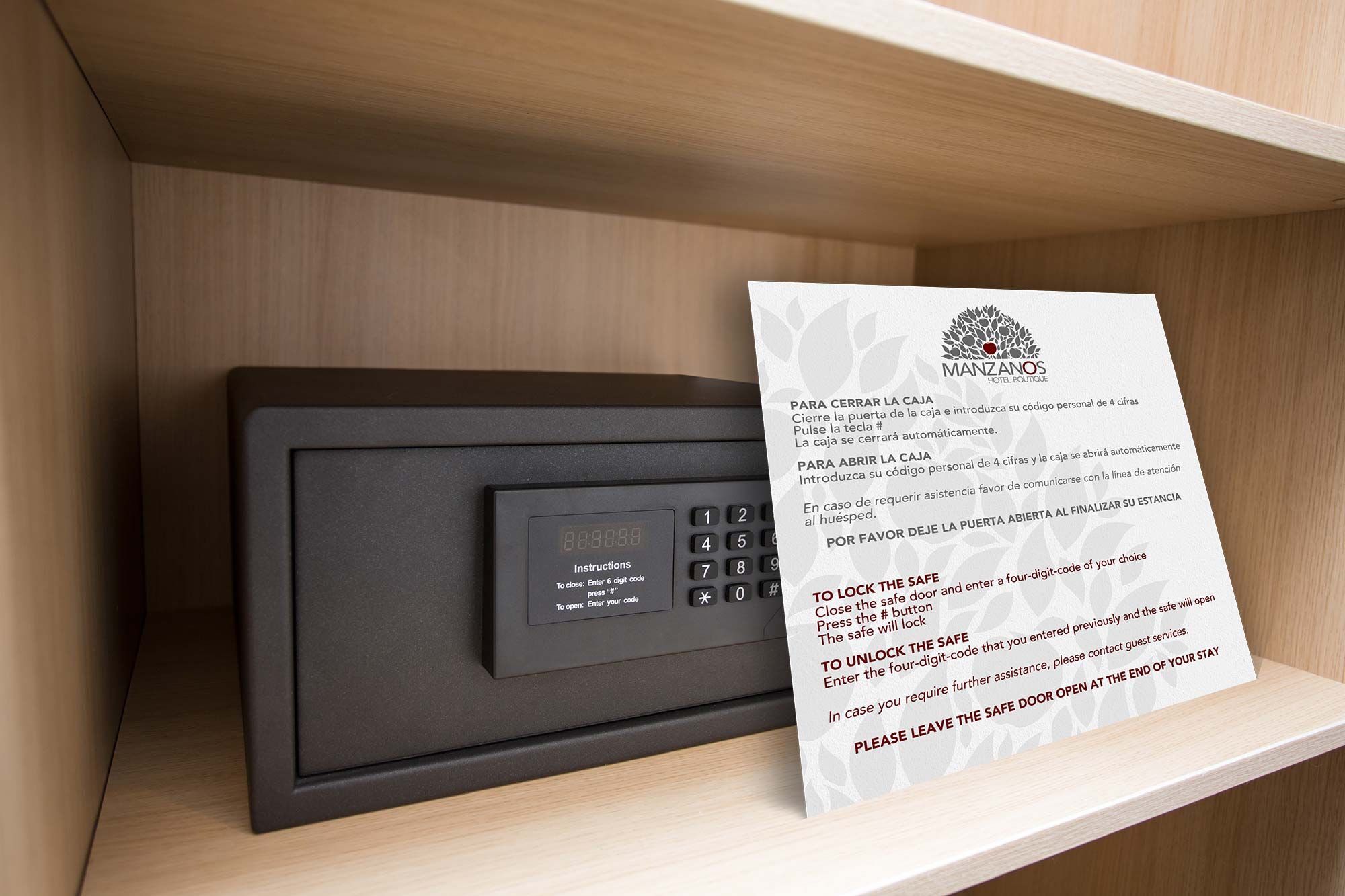
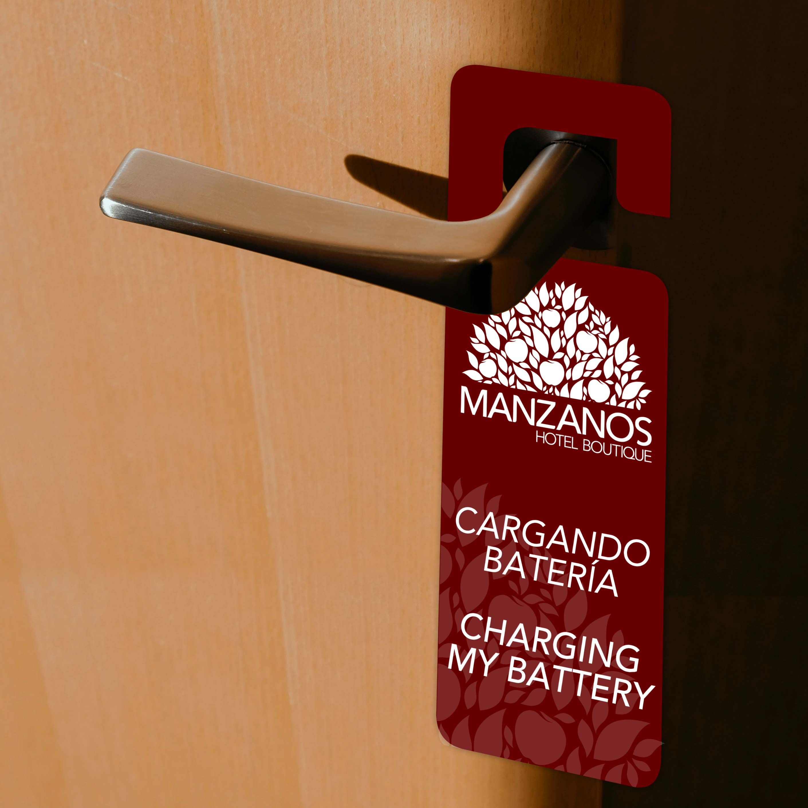
The art behind the scenes
Manzanos is a unique hotel concept, and ensuring standardization is a crucial element for the success of the business model.
Detailed Standard Operating Procedures (SOP) have been designed as a guiding reference for team members to consult when in doubt.
Step-by-step, easy to understand, and user-friendly procedures will clarify most doubts to empower all team members of Manzanos to create unique experiences focused on attention to detail and professionalism.
The methodology behind the business model is to get to know our guests as if they were life-long friends that were stopping by for a visit.
The experience, as a whole, flows from beginning to end flawlessly and pleasantly—the result is memories worth telling and living again and again.
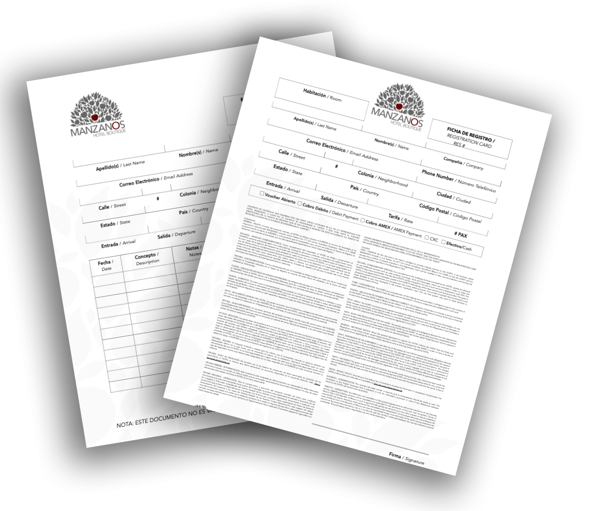
Forms
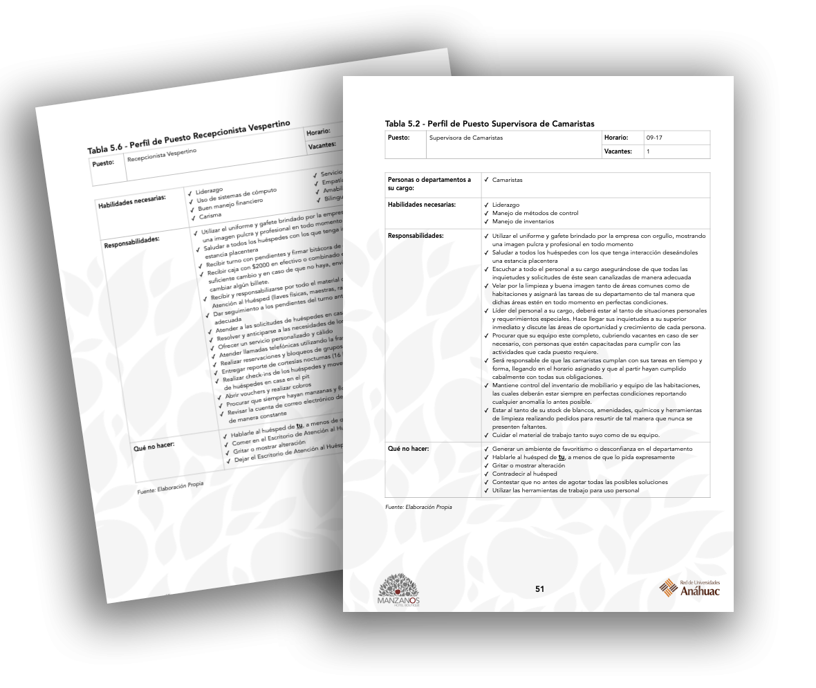
Role Descriptions
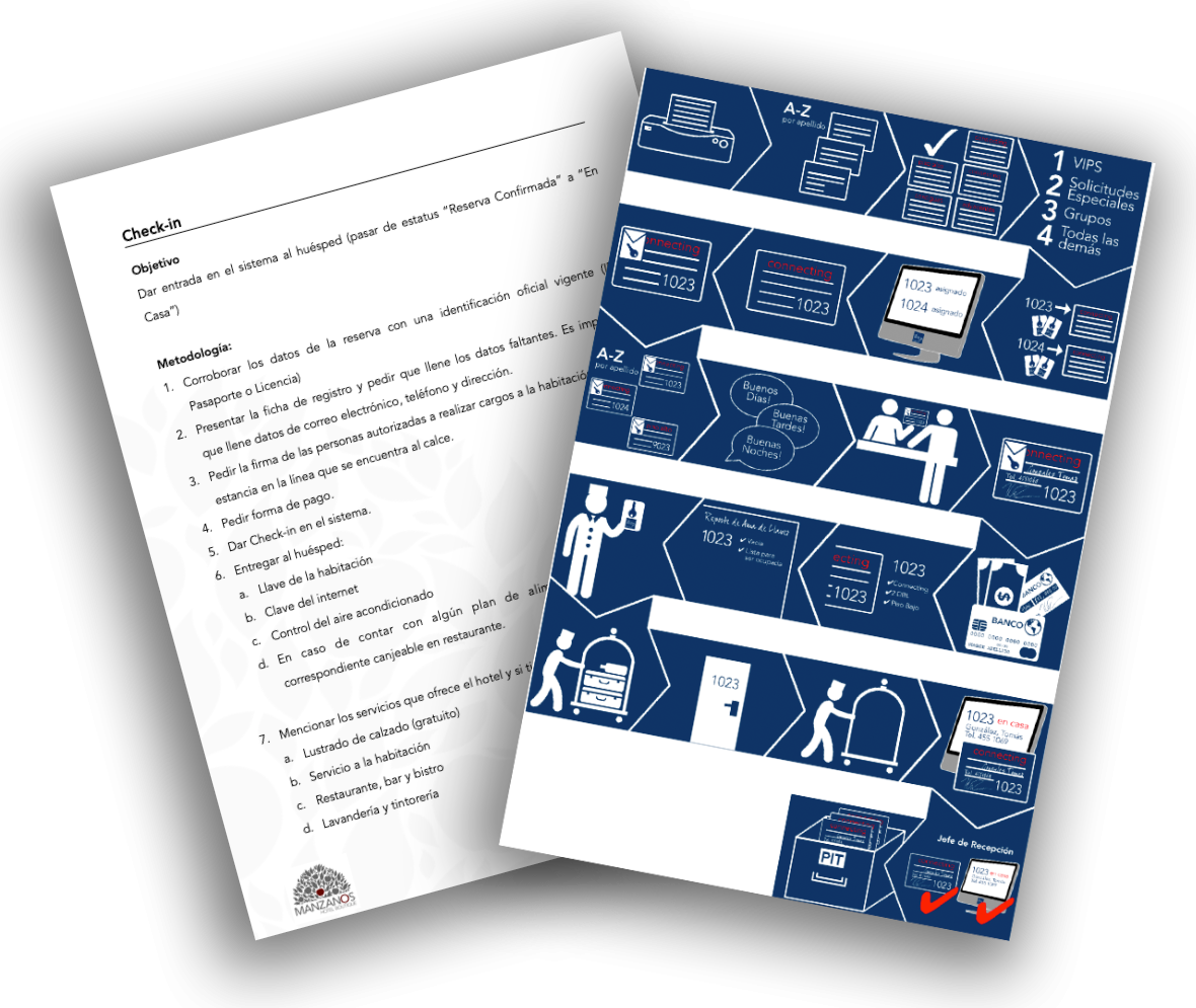
Procedures